Olive
A cross-platform consolidator of all things health.


Timeline
6 months
Role
Sole Contributor
Discipline
Market Research, User Research, Product Strategy, User Experience, Information Architecture, Usability Testing, Interaction Design, Visual Design
Tools


Olive is a health & wellness platform that empowers users to consolidate, control, analyze, and understand their medical, fitness, and wellness data.
I was inspired to design a health tech platform because of my background in bioethics.
Problem
Wellbeing is an integral human need.Yet keeping track of symptom, fitness, and mood data and making sense of diagnoses, treatments, and diagnostics tests from overburdened healthcare providers is time-consuming, cumbersome, and often invasive.
Solution
A health tech platform which allows users to log, track, and analyze their symptoms, wellbeing metrics, and medtech device data. A platform which allows users to selectively share their data with their healthcare providers. A platform which educates users on their diagnoses, treatments, and diagnostic tests.
Design Process
I set out to understand what people want and need from a health tech platform.
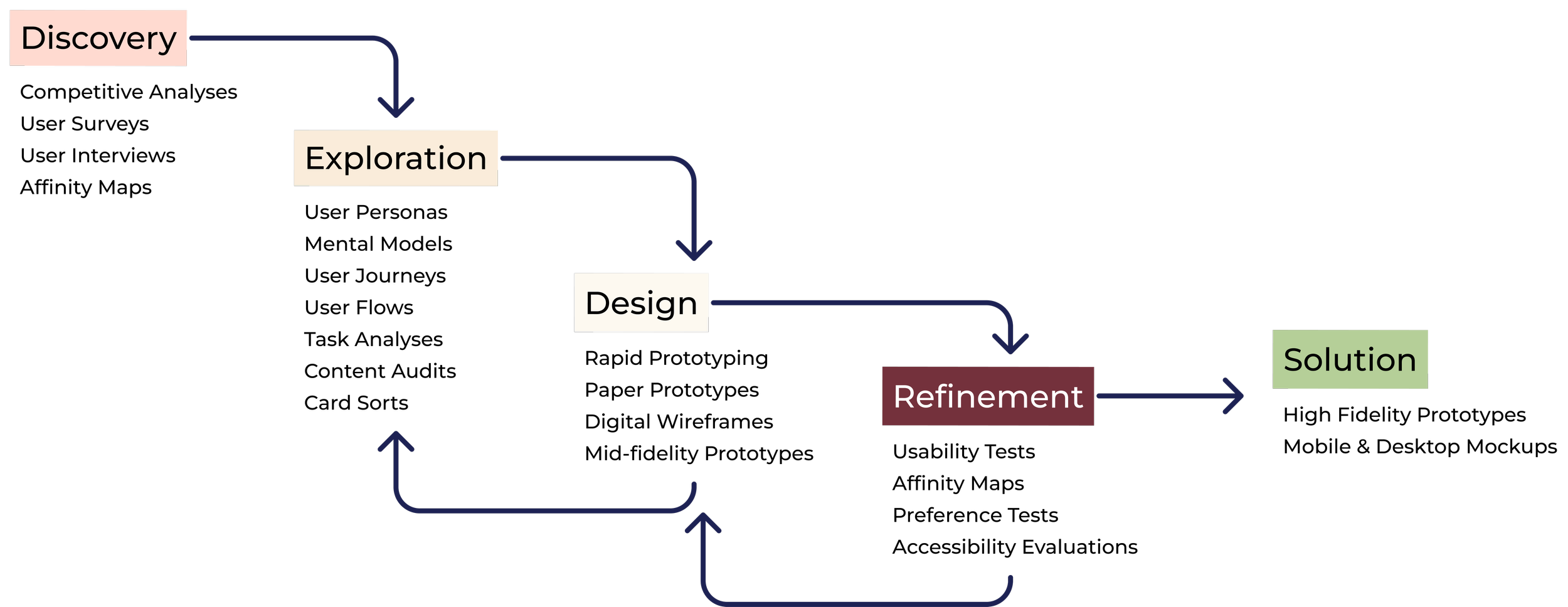
Discovery
Competitive Analysis
I began my Discovery phase with a competitive analysis of a dominant player in the health tech space, Epic’s MyChart.
Key Objectives
MyChart is an institution-specific patient portal. Patients can access their histories, test results, medications, and appointment summaries from multiple institutions.
Scheduling, telehealth, and health record sharing is also available.
Overall Strategy
MyChart does not target independent patient adoption. Healthcare providers market their version of MyChart to their patients (Boyden & Youngblutt, 2022). Patients will use MyChart - even if they do not like it - if it is the only way to access their digital health records.
Greatest Asset
MyChart can display and connect records from any health system which uses the Epic software.
From 2019, Epic covered 39% of the 880,000 hospital beds in the United States (Jennings, 2021). Many providers are already bought in, making adoption easier for patient users.


SWOT Analysis

Market Advantage
Epic, MyChart's parent company, is a dominant vendor in the health IT market (KLAS Research, 2022).Scheduling, telehealth, and health record sharing is also available.
Footnotes
Boyden & Youngblutt. "MyChart Campaign." 2022, from: https://b-y.net/work/mychart-campaign/.
Jennings, Katie. (April 8, 2021). The Billionaire Who Controls Your Medical Records. Forbes. 2022, from: https://www.forbes.com/sites/katiejennings/2021/04/08/billionaire-judy-faulkner-epic-systems/?sh=5fd2b19c575a
KLAS Research. (2022). Enterprise Software Suite Solutions, KLAS Research. 2022, from: https://klasresearch.com/best-in-klas-ranking/enterprise-software-suite-solutions/2022/197
Olive’s Differentiation
A user’s experience of the prominent health tech platforms is dictated by their provider institution. There is no way to input wellbeing metrics which are not medical and have not been requested by your provider.
Fundamentally, MyChart and its competitors are tools for patients to access the digital health records each institution has for them, and not a tool for managing overall health and wellbeing.
Yet MyChart's market position is sufficiently strong that direct competition is not feasible. There is an opportunity, however, to lean upon MyChart’s strong position.
A product which subsumes wearable data, tracks wellbeing metrics, such as fitness, diet, mood, and mental health symptoms, and interfaces easily with MyChart to seamlessly import these metrics would be quite valuable for the 160 million patients who use MyChart (MyChart, “Homepage”).
Impact of Competitive Analysis
Research Focus - Investigate MyChart users
Design Decision - UI to be intelligible to those who have used MyChart before
Design Decision - To display medical data alongside health and other wellbeing data
Footnotes
MyChart. “Homepage." 2023, from: https://www.mychart.com/.
User Survey
Prior to conducting user interviews, I want to gather an assortment of user attitudes, behaviors, and opinions on health tech and health data.
I conducted a user survey to learn:
Which health tech platforms respondents use, how they interact with these platforms and if users have any unmet needs with their current health tech platforms.
User’s attitudes towards health data policy and their trust in their health tech platforms.
Tools

Survey Results
Collectively, respondents utilize 40 unique health, fitness, and wellbeing applications.
Majority of participants use their health, fitness, and wellbeing apps between 1-3x a day and 1-3x a week.
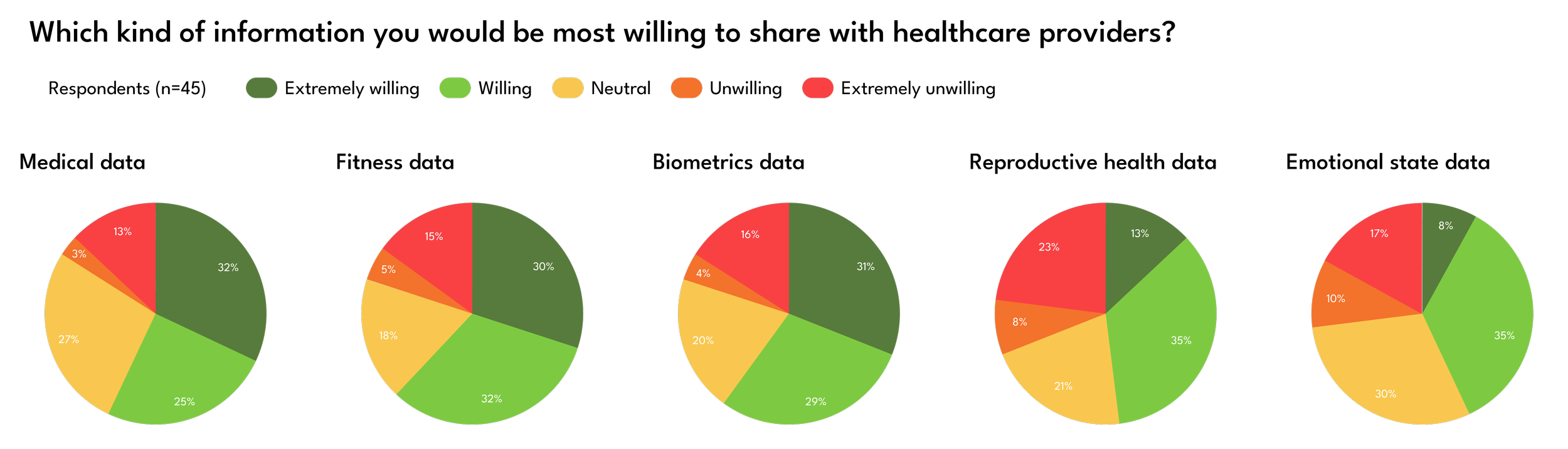
Respondent attitudes on the importance of privacy and data protection on emotional state, reproductive health, biometric, and health data was predominantly homogenous.
Written survey comments indicate a number of data types which respondents currently cannot track with their health, fitness, and wellbeing applications.
Impact of Survey
Research Focus - Find granularity in user attitudes on privacy and data protection for different kinds of data.
Research Focus - Identify which data types users wish they could track.
User Interviews
I wrapped up the Discovery phase with user interviews, using the survey results to determine my lines of questioning.
I conducted interviews in order to corroborate survey results, specifically to:
Identify potential user needs that are not currently met by the health tech platforms.
Ascertain nuances in user's attitudes towards health data privacy and trust in health tech platforms
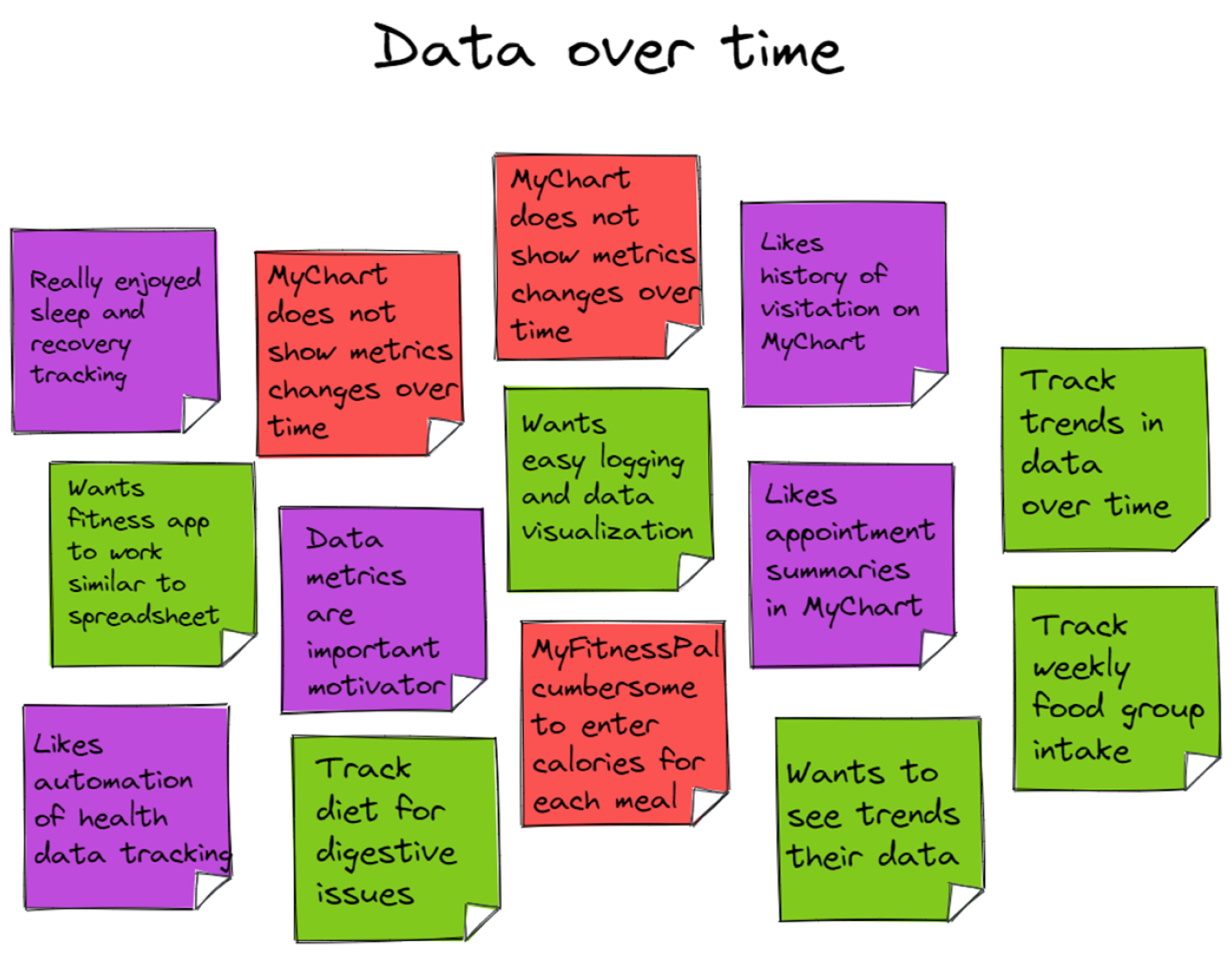
I used affinity maps to categorize and analyze interviewee quotes and statements.


Tools


Basics
4 interviewees
Aged 24-30
All MyChart Users
Students & Professionals

Key Insights from User Interviews
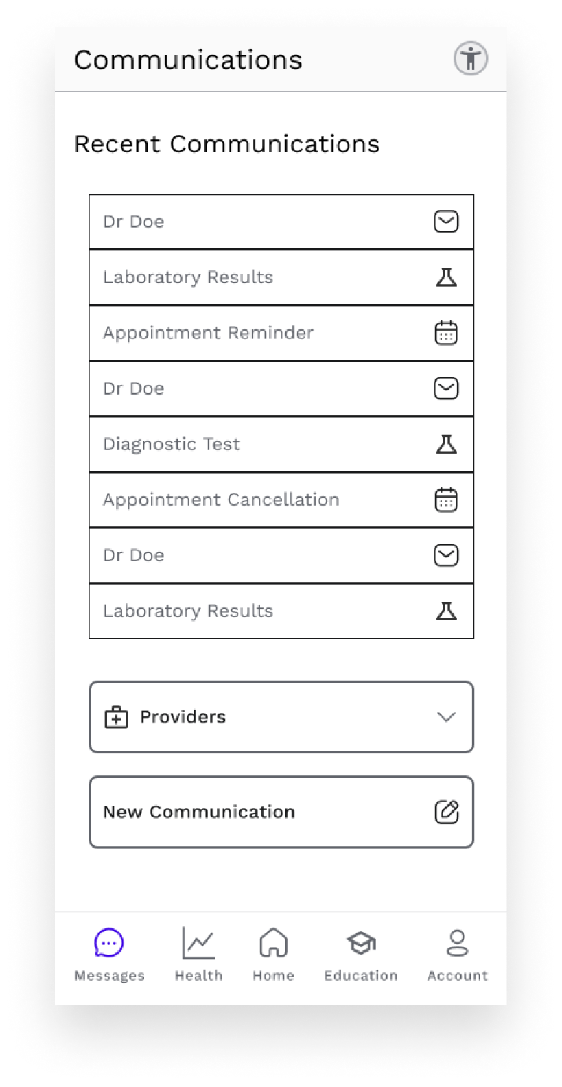
Integration
Users want a centralization of cross-provider and provider-patient communication.
User want to aggregate all of their health, fitness, wellbeing, and medical data.
Provider Communication
Users want to communicate to their providers for non-urgent matters and send pre-appointment messages to their providers.
Observe & Analyze
Users want to automatically track their health, fitness, wellbeing, and medical data over time and to observe trends through data visualizations.
Sensitive Data
Users are willing to broadly share their data with their healthcare providers, but still want to be selective for more sensitive data.
Users consider mental health and emotional state data more sensitive than fitness data.
Comprehension
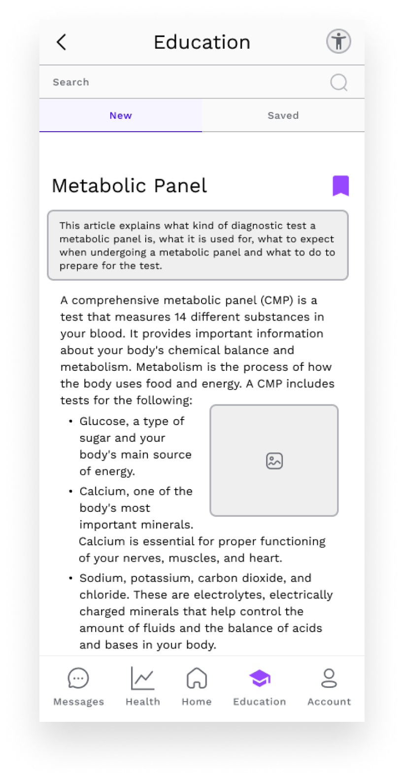
Users want their medical tests, like blood panels, explained to them in layman's terms or with easy-to-parse visualizations.
Impact of Interviews
Design Decision - Centralize health, fitness, and medical data and cross-provider and provider-patient communication.
Design Decision - Give users control over which kinds of sensitive personal data are sent to providers.
Design Decision - UI and copy must elicit trust, calm, and self-care from the user.
Exploration
User Personas & User Flows
I gathered my insights from the Discovery phase and began the Exploration phase, during which I investigated potential navigational and categorical structures for Olive.
In order to pinpoint users needs, frustrations, and goals, I generated user personas

Tools
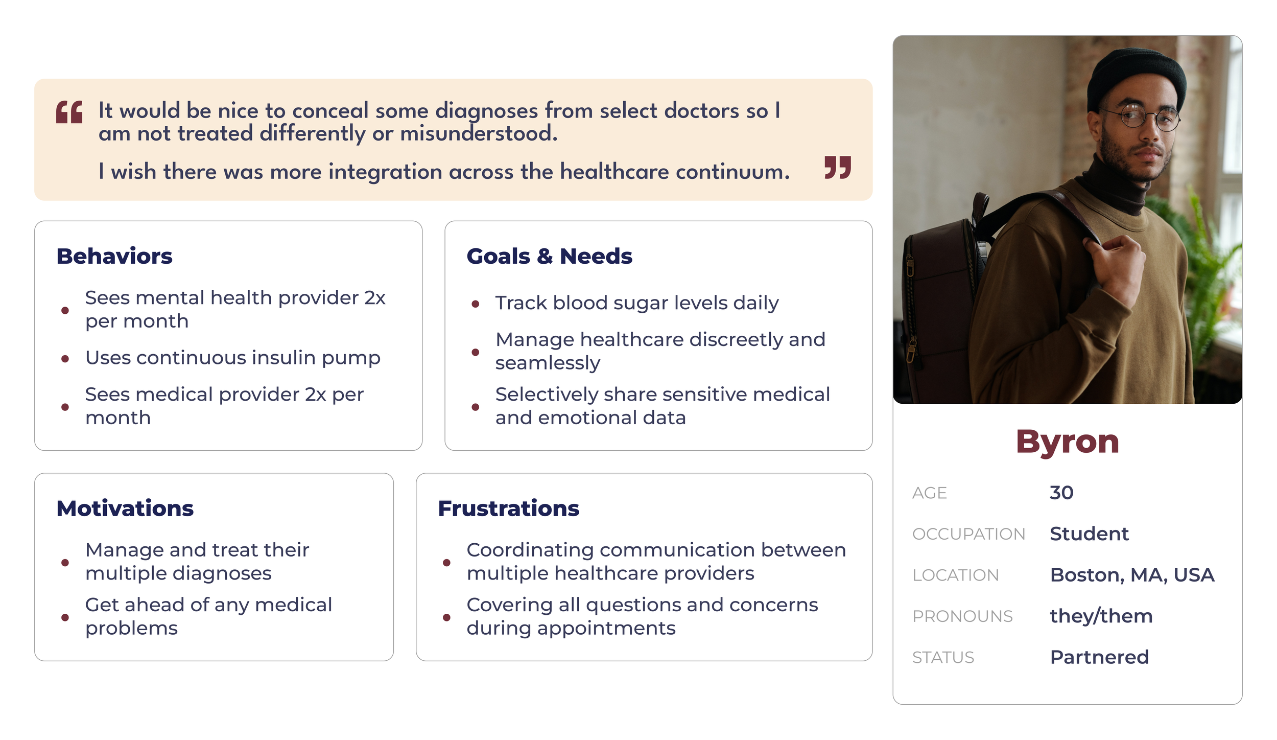
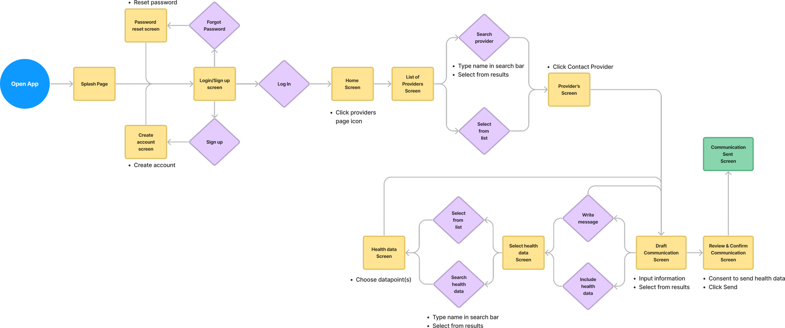
Byron and Philippa represent the amalgamation of qualitative and quantitative characteristics identified through my multimodal user research. My research indicates that users want to be able to seamlessly share information between multiple providers and to understand and identify trends in their health and wellbeing data.
Philippa, with her desire to record, observe and quantify her exercise and behavior and Byron, with their need to coordinate with providers across the healthcare continuum, encapsulate these insights, respectively.
Olive’s product requirements necessitate inclusivity and data privacy and protection.
Byron with their need to manage multiple sensitive diagnoses, and Philippa through her desire to share reproductive health information with her providers, are well aligned to the project’s demands.
Philippa’s User Flow


Byrons’s User Flow
Key Insights from User Personas & Flows
Visualization & Analysis
Users need to record and access their health data, analyze their health data, and view their health data through time and other relevant axes.
Data Sharing, Permissions & Privacy
Users have unmet data sharing and communications needs; they want to communicate with providers while controlling what health information providers can access.
Education
Users require access to trustworthy educational health information within their health tech platforms.
Impact of Personas & Flows
Design Decision - Olive needs to have:
A message feature with consent form
An internal content feature
An upload feature
Research Focus - Information Architecture ideation processes - such as site maps, content audits, and card sorts - will be beneficial for determining Olive’s structure.
Three Principle Functions
To enable users like Byron and Philippa to meet these needs, Olive needs to have three principle features.
The ability to send messages to providers and health data access
The ability to find content and save content
The ability to upload data for record-keeping, analysis, and visualization
Site Maps & Card Sorts
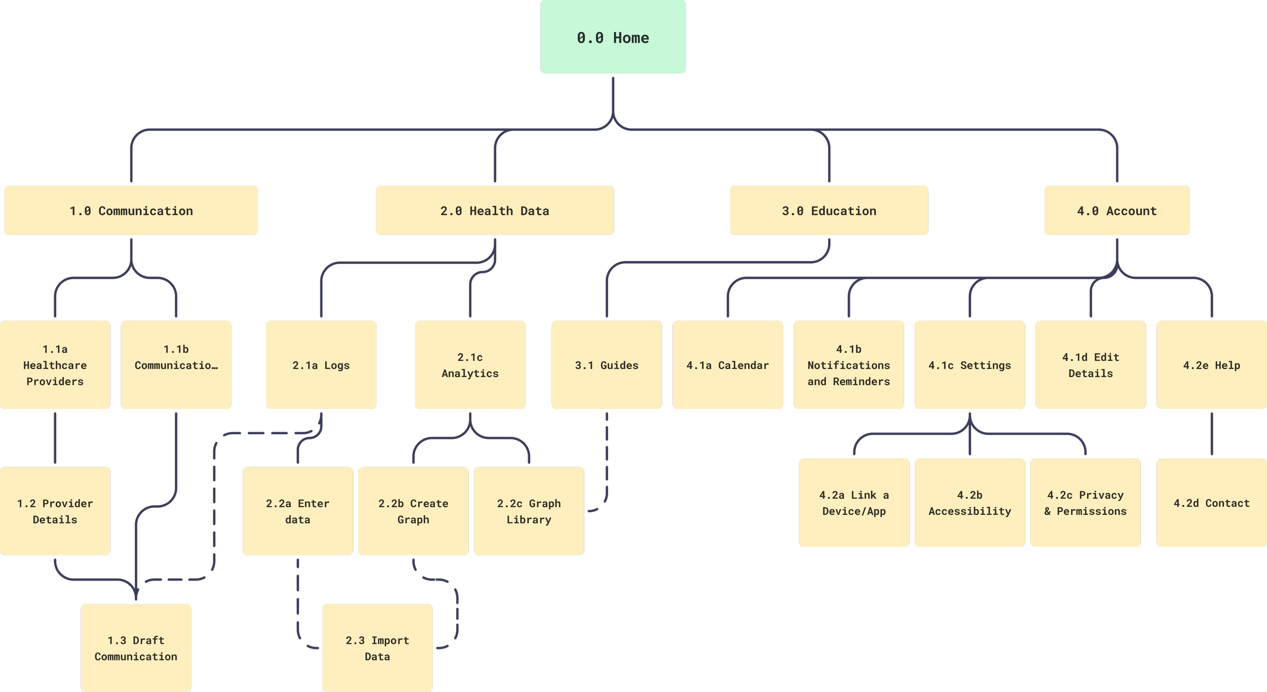
To draft the outline of a solution which incorporated user needs and the key features identified, I began to develop an information architecture of Olive.
I selected a hierarchical navigational structure for Olive.
A centralized display of all health data - medical, fitness, emotional state, reproductive, and device data - emerged from the Discovery phase as a fundamental valuable feature Olive could provide - A parent page for consolidating all such data was necessary.
From my Competitive Analysis I decided to render Olive familiar to MyChart users - I selected “Providers” as a term for a parent page.
Mindful of Byron and Philippa’s user flows, I allowed for movement from between navigationally unrelated child pages at distinct points in the hierarchy, as represented by the dotted lines.

Tools
Card Sort
Similarity Matrix
In order to test the site structure I had drafted for Olive, I conducted a card sort.
I wanted to determine if:
Users thought any screens or hierarchies were nonintuitive in their categorization.
Users considered any screens or subdivisions redundant or unnecessary.
Users would devise categories I would not have conceived.
Users would understand the taxonomy.
To the left you can see a Similarity Matrix generated from the results of the card sort.

Basics
11 participants
Open card sort
Results
The majority of participants, 54%, divided the screens into 4 categories.
Many screens in the Account and Settings categories were grouped under the same section by participants.
Only 9% of participants categorized the Import Data screen with the Settings page.
At least 72% of participants categorized the Import Data screen with one of the health data types.
Revised Site Map
Impact of Card Sort
Information Architecture Decision - In the revised sitemap, Import Data will be grouped in the Health Data section.
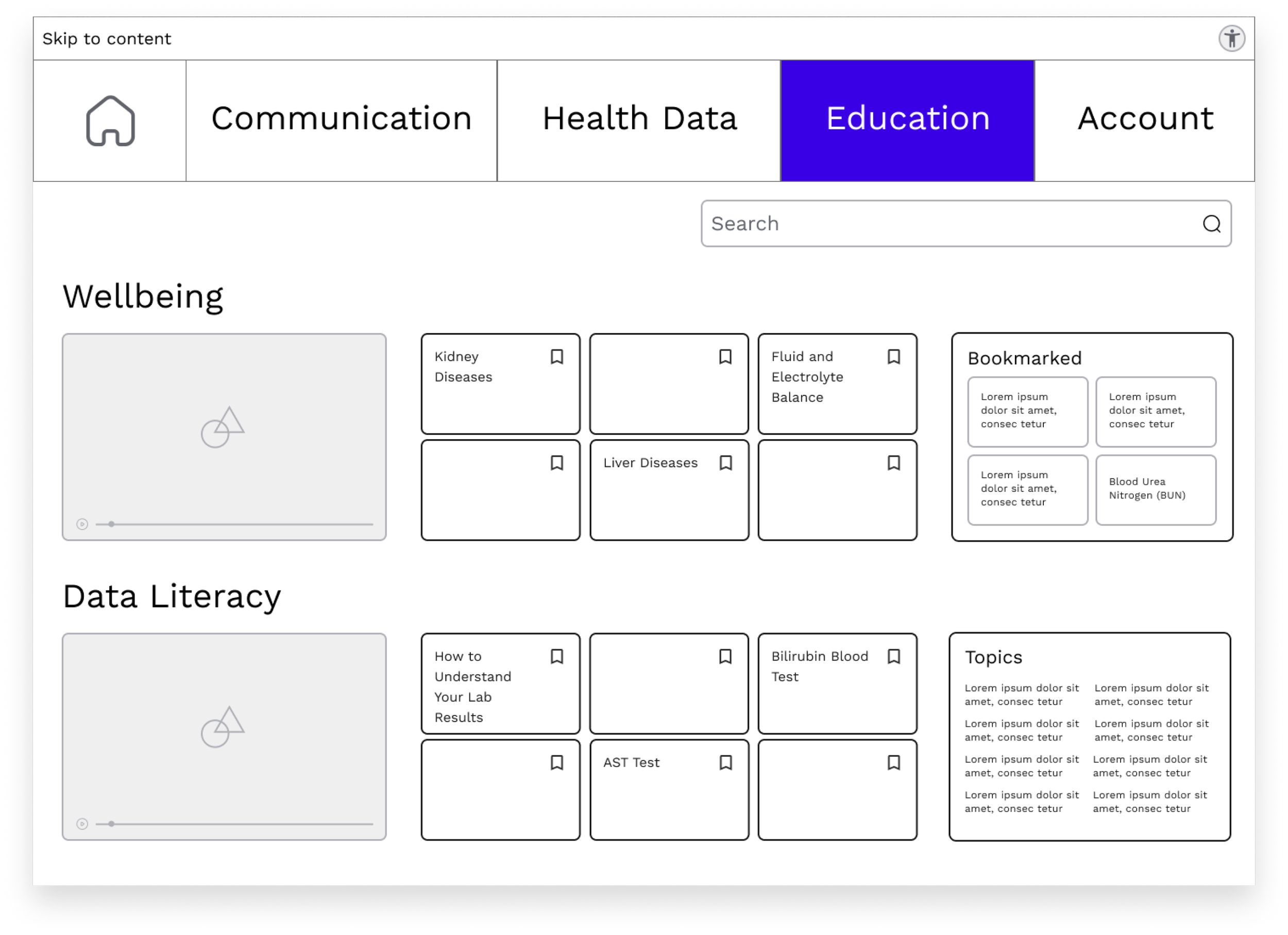
Information Architecture Decision - In the revised sitemap I renamed two sections - Providers to Communication and Resources to Education - to reflect the labelling choices of users.
Information Architecture Decision - In revised sitemap, the Account and Settings sections are consolidated.
Design
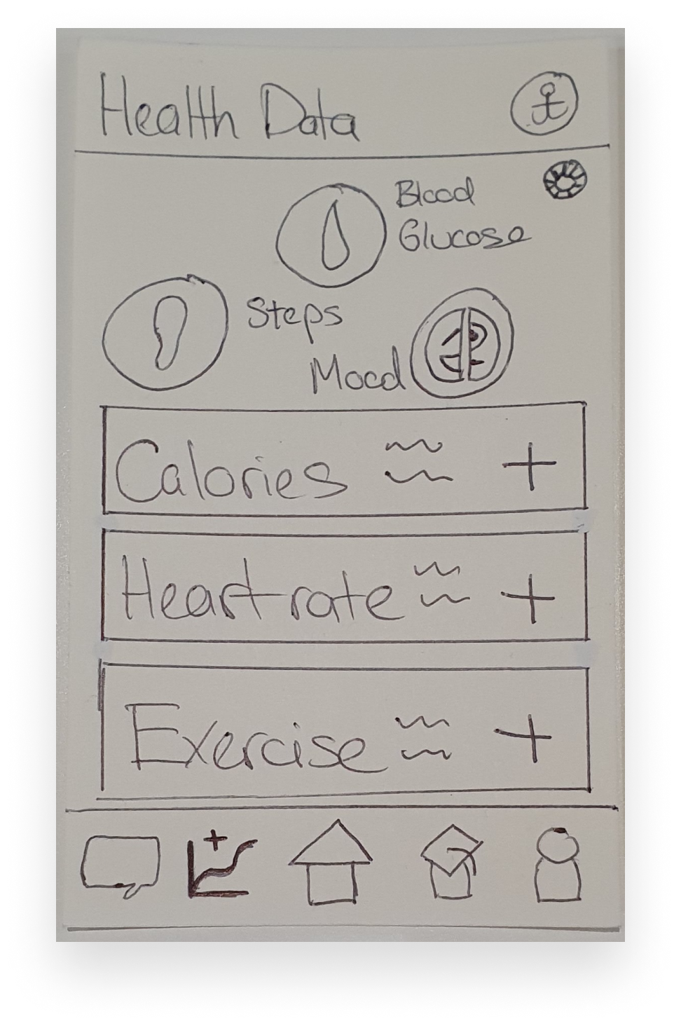
Sketches
Bookmark an article


Send a message


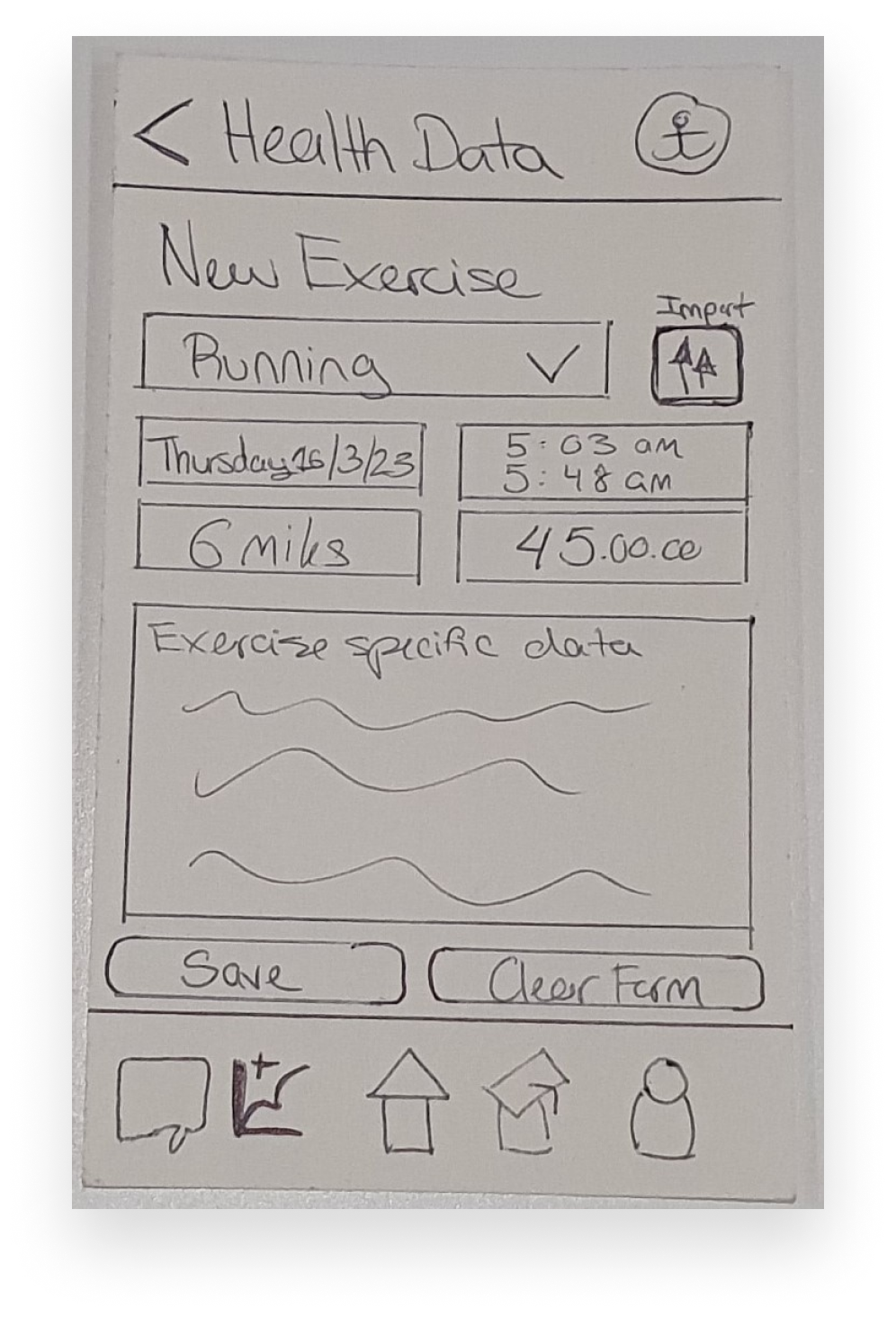
Add exercise data


Wireframes


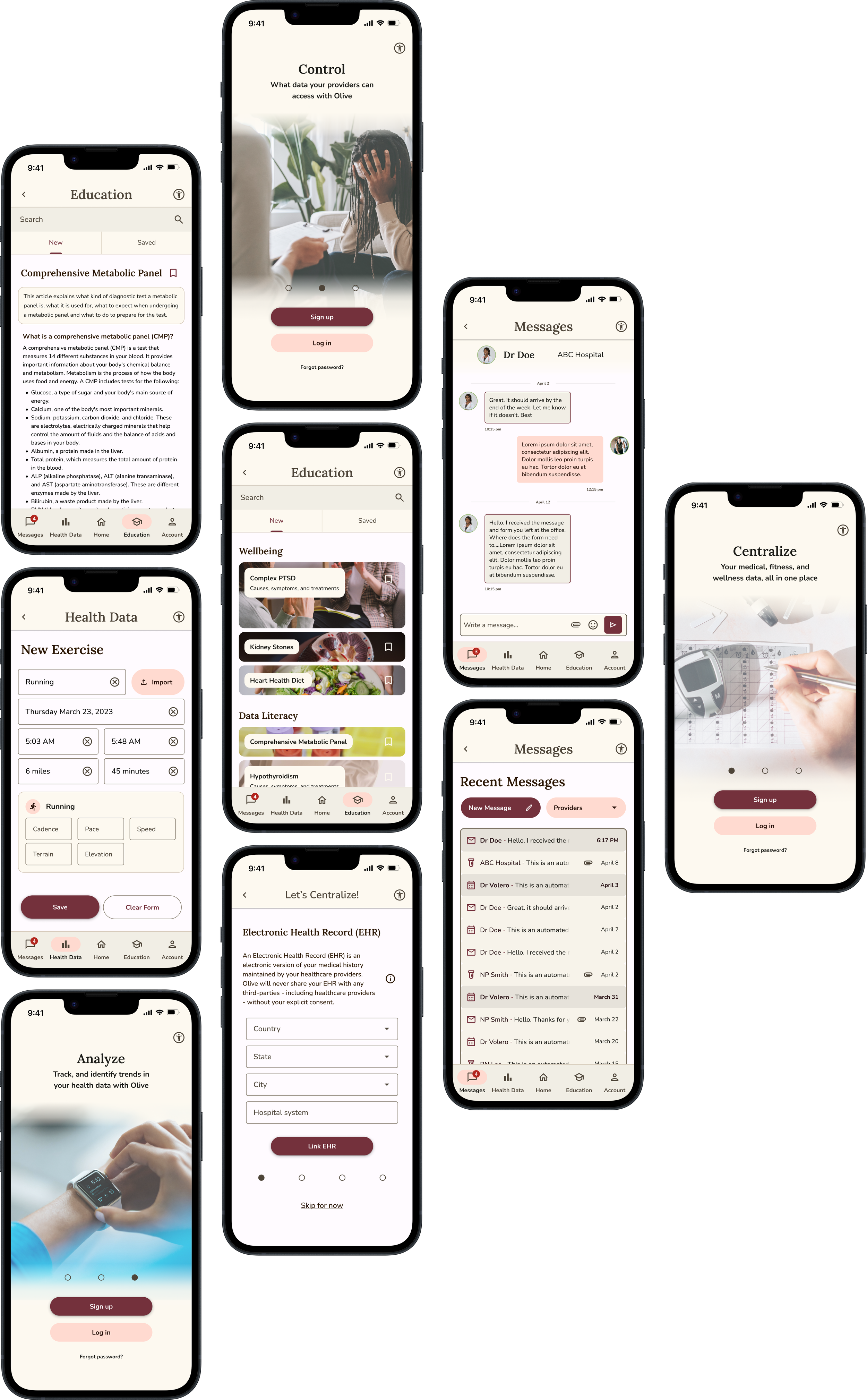
Introduction
Since Olive's functions are complex and its value is in its cohesion and centralization - not in any of its individual functions - I opted for a benefit-oriented introduction experience.
I utilized a card swipe introduction pattern to communicate Olive’s benefits.
Onboarding
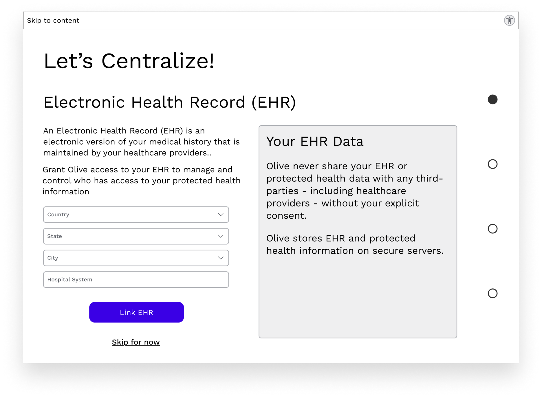
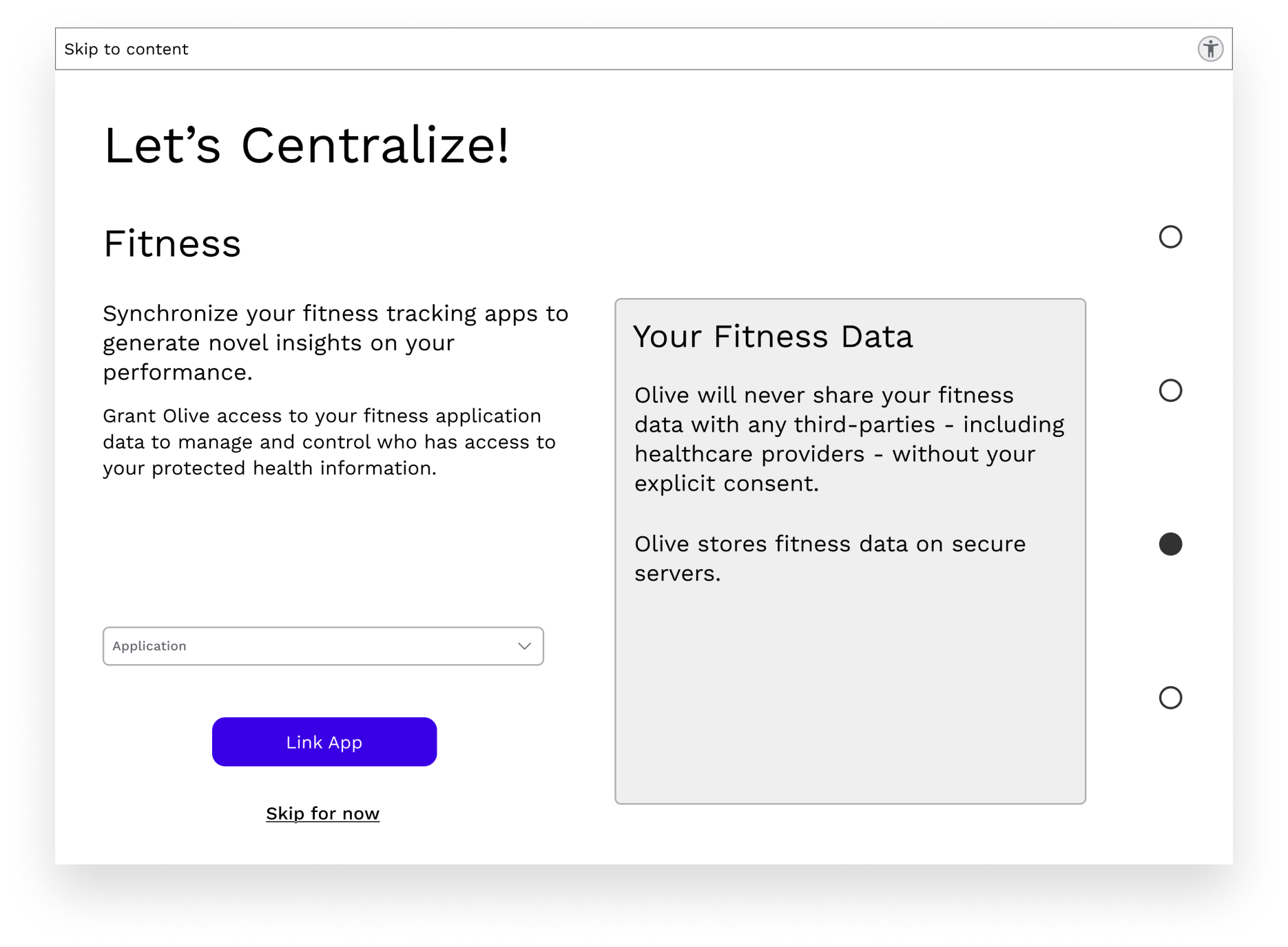
After account creation, to avoid a completely empty homepage and to demonstrate Olive's value as a centralizing platform, I included four optional data import and third-party platform linking prompts.
On the desktop version, I utilized the extra screen space to inform the user how Olive will use their data and how Olive treats data of varying sensitivity.


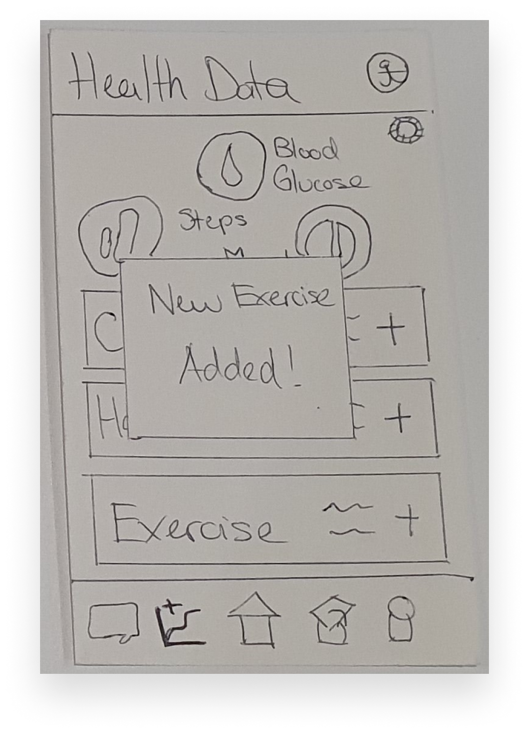
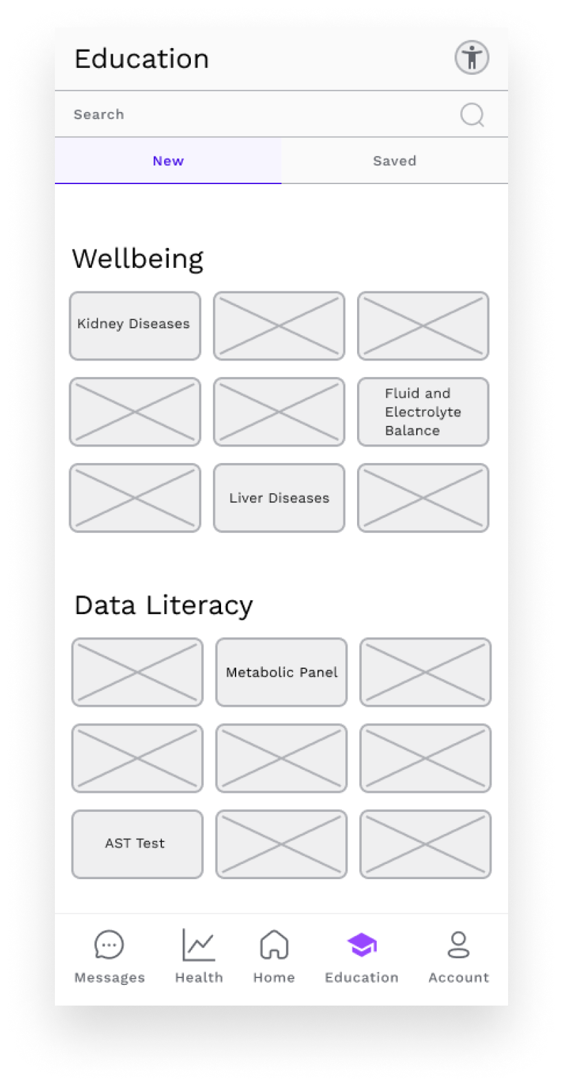
Home
Customizable data bubbles to display user health data. Maximum 3 on mobile.
I opted for tab navigation system as Olive has few yet equally important sections.

Universal symbol for digital accessibility sits in the top bar, which also contains the screen title.
Cards display simple and recent health data, health goal progress, and task status information.
A top tab navigation bar was selected for the desktop version to ensure user familiarity with the navigation pattern.
Maximum 5 customizable data bubbles on desktop.

The slim accessibility bar runs across the length of the desktop screen; on the left a "Skip to Content" link for keyboard users.
Recently bookmarked articles and popular topics appropriately utilize increased screen space.
Bookmark an article

Send a message

Add exercise data


UI Design
For Olive’s user interface, I studied and drew inspiration from Material Design’s design system.
Color Design
Olive’s color palette was curated to evoke trust, calm, and self-care in its users.
Trust - Getting users to trust Olive with their sensitive and intimate health information necessitates sincerity, wisdom, and competence.
Calm - Stimulating relaxation and thoughtfulness enables users to feel a sense of calm when using Olive to manage often distressing health information.
Self-care - Telegraphing health, wellbeing, and a touch of enjoyment stimulates users to be interested in taking care of their health.
Footnotes
Labrecque, L. I. & Milne, G. R., (2012). Exciting red and competent blue: the importance of color in marketing. Journal of the Academy of Marketing Science, 40, 711-727. https://doi.org/10.1007/s11747-010-0245-y
Lupton, Ellen. (2017). Design is Storytelling. Cooper Hewitt, Smithsonian Design Museum.
Wine
Secondary
Tertiary
Salmon
92B66C
Neutral
74313C
EB957D
Olivine
Eggshell
F4F1DE
Neutral Variant
Sunset
F2CC8F
Evokes wisdom, responsibility and respectability
(Labrecque & Milne 2012, 714)
Evokes a touch of enjoyment and wellbeing (Labrecque & Milne 2012, 714)
Evokes health, calm, wellbeing, trustworthiness
(Lupton 2017, 107)
Evokes respectability, sincerity, calm, thoughtfulness
(Labrecque & Milne 2012, 716)
Evokes relaxation, thoughtfulness, and wellbeing, and some enjoyment
(Lupton 2017, 108)
Primary
Typography
Lora SemiBold, with its serifs and calligraphic references telegraphs respectability, knowledge, and trustworthiness (Cee 2022; Kastl & Child, 1968).
Modern, sans-serif, Nunito’s rounded letters and curves evoke enjoyment, sincerity, and openness (Cee 2022; Kastl & Child, 1968).


Footnotes
Kastl, A. J., & Child, I. L. (1968). Emotional meaning of four typographical variables. Journal of Applied Psychology, 52(6, Pt.1), 440–446. https://doi.org/10.1037/h0026506
Cee, Dora (August 4, 2022). Becoming type-sensitive with font psychology. UX Collective, from https://uxdesign.cc/getting-type-sensitive-with-the-psychology-of-fonts-8e8758d70433
Icons


Navigation


Data Bubbles

Buttons


Refinement
Usability Testing
To ensure that Olive met user’s needs and its structure and UI was pleasing and intelligible to users, I conducted qualitative usability tests with members of the target user population.
Test Objectives
Observe how testers interact with Olive
See if testers can complete assigned tasks
Identify usability problems
Participants
6 testers. Aged between 18-35. Based in the USA.
Tools

After each test session, testers completed a 10-point System Usability Scale (SUS) questionnaire.

Some used:
Assistive technology
Health monitoring equipment

8 tasks:
4 on the mobile prototype
4 on the desktop prototype
Process
Remote, recorded, and moderated 30-60 minute test sessions.
Some were:
Nonbinary
Neurodivergent
Usability Test Results
I analyzed the data from the testing sessions, and used affinity maps to group observations.

Errors made by testers were assessed and categorized with Jakob Nielsen’s Severity Scale for Usability Problems.
Overall, Olive received an average SUS score of 76.7%
4 out of the 6 participants completed all tasks, the remaining two completed all but one.
Usability Problems
I identified the issues which posed the most severe usability issues, and refined Olive to resolve these issues.
Issue
When sending a message to a previously contacted provider, accessing a running dialogue was more intuitive for users than starting an unconnected, new thread.


Version - Mobile & Desktop
Severity - High
Evidence
5 out of 6 testers first clicked the button that contained the most recent communications with the scenario provider. Only after it did not work did they click the “New Communication” button.
4 of the 6 testers explicitly stated that they found the lack of running dialogue with provider unintuitive.
Solution
I redesign the entire Send a Message flow as a running dialogue.
Issue
The search bar was not sufficiently noticeable.
Version - Desktop
Severity - High
Evidence
5 out of 6 testers struggled to find the search bar on the Education page.
Solution
I attached the search bar to bottom of navigation bar.

Issue
Bookmark button does not catch user’s attention.
Version - Desktop
Severity - Medium
Evidence
2 out of the 6 did not actually bookmark the article even though they had successfully navigated to the article page.
Solution
I increased the size of the bookmark button and made its section of the desktop more prominent.


Accessibility Evaluation
I conducted an accessibility analysis to ensure Olive could be utilized by diverse users. I strove for conformance to Level AAA of Web Content Accessibility Guidelines (WCAG) 2.1. Below is one example of the alterations I made.
Issue
The lines and bars of Olive’s charts were difficult to tell apart, especially for those with deuteranopia.
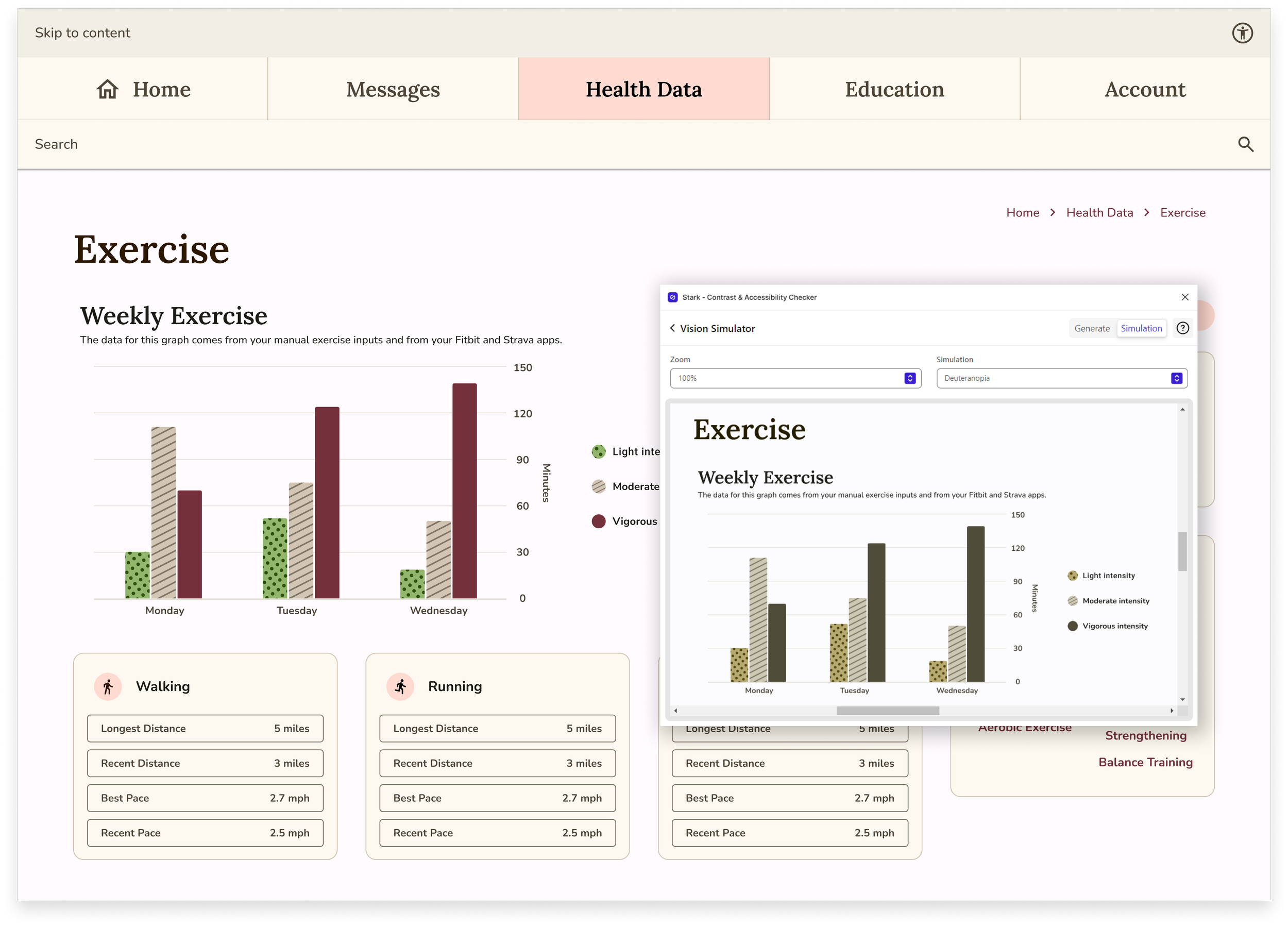
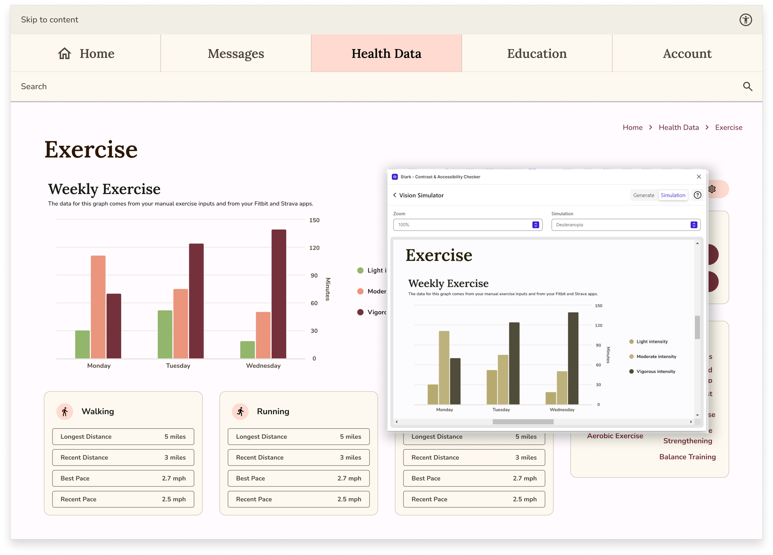
Solution
I changed the color of one of the bars from a secondary color tone to a neutral tone, rendering it more discernible for those who easily confuse red and green.
I added texture to a couple of the bars to ensure that color was not the only means of discerning between categories.
Solution
Feel free to explore Olive’s prototype below

Learnings
Tools & Techniques
Researching and designing Olive was the first time I used many of the tools and techniques discussed, including software, such as Figma, Crowdsignal, and Optimal Workshop, as well as frameworks and processes such as user personas, user journeys, user flows, content audits, and site maps. Learning how to navigate new software and conceptualize novel approach while trying to deploy them effectively and efficiently is an immense challenge.
Not only am I now proficient in these software platforms, I have developed confidence in my ability to understand and quickly learn to deploy new methodologies.
Visual Design & Perfectionism
Selecting Olive’s typography and color palette and designing Olive’s UI elements activated my perfectionist impulses. I began overanalyzing the significance and impact of every UI decision, even ultimately inconsequential ones. Olive was an excellent opportunity for me to learn to put into practice the mantra “Done is better than perfect”.
Through the visual design process for Olive, I learned more effective techniques of recognizing obsessive overanalysis and how to disengage myself from these patterns.